
How Grout Color Affects the Look of Your Tile
Grout fills the joints between tiles, but its visual role extends beyond those narrow spaces. The color you choose can make individual tiles more distinct, soften the lines between them, or change how strongly a pattern appears across a wall or floor. Understanding that relationship can help you evaluate grout as part of the overall tile design rather than leaving the decision until the end.
Why Grout Color Matters in a Tile Design
Tile usually receives most of the attention during material selections. There is the tile color itself, along with its shape, finish, and pattern. Once those decisions are made, grout can feel like a smaller detail.
Visually, though, grout becomes part of every tiled surface.
Each grout joint creates a line around the tile. Depending on its color, that line can either be easy to see or relatively quiet. Across an entire backsplash, shower wall, or floor, those individual lines add up. They influence whether your eye notices the shape of each tile or reads the installation as a more continuous surface.
This is why the same tile can look noticeably different when paired with two different grout colors.
How Contrast Changes the Appearance of Tile
One of the first considerations when choosing grout color is how much contrast you want between the tile and the joints surrounding it. MAPEI describes two common approaches to grout color: creating contrast between the grout and tile or choosing a closely related color for a more blended appearance. From there, the amount of contrast influences how prominently the individual tiles and their pattern appear.
A light tile paired with darker grout creates visible separation between individual pieces. White tile with dark gray grout is a familiar example. Because the grout lines are easy to see, the shape and arrangement of the tile become more prominent.
The reverse can work as well. Light grout against dark tile outlines the individual pieces and brings more attention to the pattern of the installation.
This effect becomes especially noticeable when the tile itself has a distinctive shape. A contrasting grout color allows those edges to remain visible from farther away, so the geometry of the installation has a stronger presence in the room.
That does not automatically make contrast the right choice for every project. It simply gives the tile pattern a larger visual role.
What Happens When Grout and Tile Colors Are Similar?
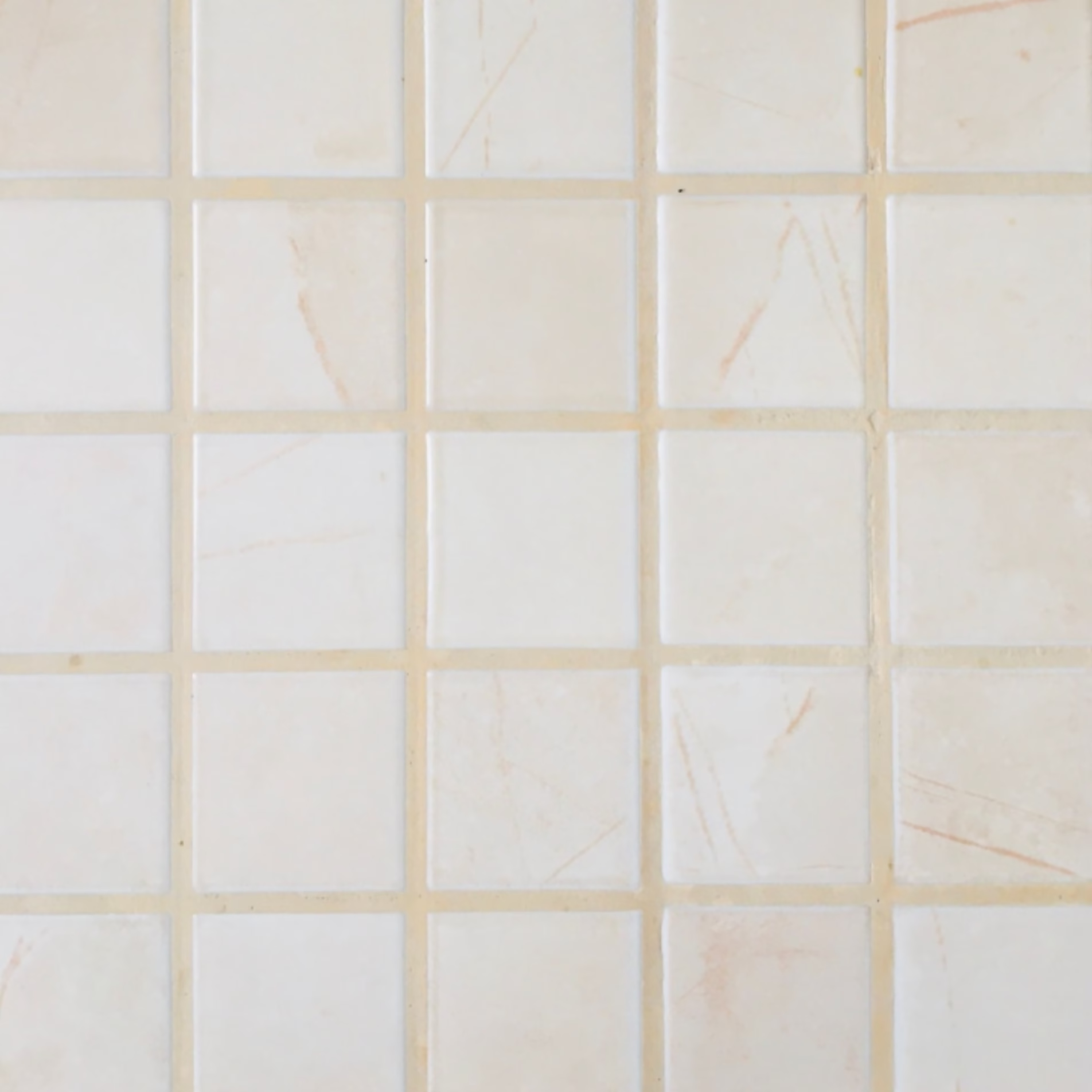
A closely matched grout color reduces the visible separation between tiles. Instead of seeing each piece outlined individually, the eye is more likely to read the installation as a larger field of color or texture.
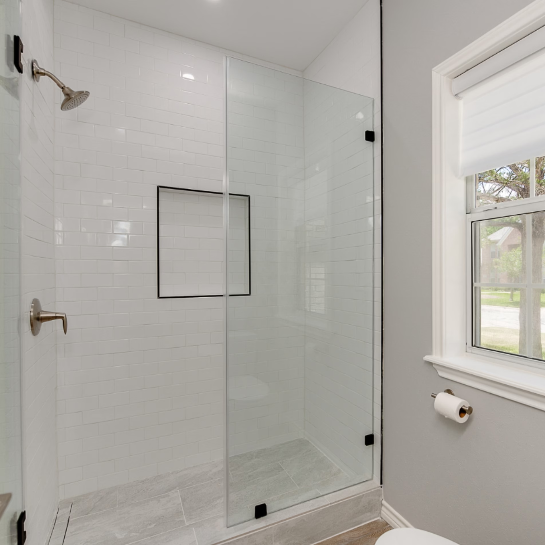
Classic white subway tile with white grout is a straightforward example. The rectangular shape remains visible because the joints still exist, but they do not command the same attention they would with dark grout. The original article points to this combination as a simple, clean approach that has remained popular over time.
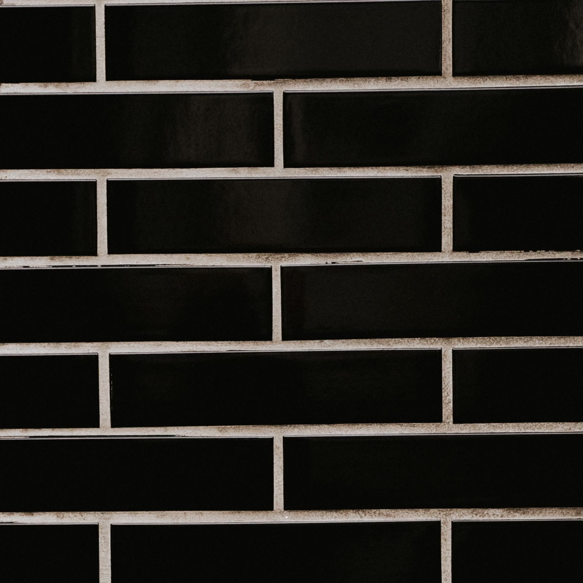
Similar grout and tile colors can also change the way an unusual tile shape is perceived. A matte black picket tile paired with black grout, for example, allows the dark surface to carry more visual weight while making the individual grout lines less pronounced.
Neither approach makes the tile disappear. The difference is in how strongly the joints participate in the design.
How Grout Color Affects Tile Patterns
The grout decision becomes particularly important when the tile pattern itself is part of the design.
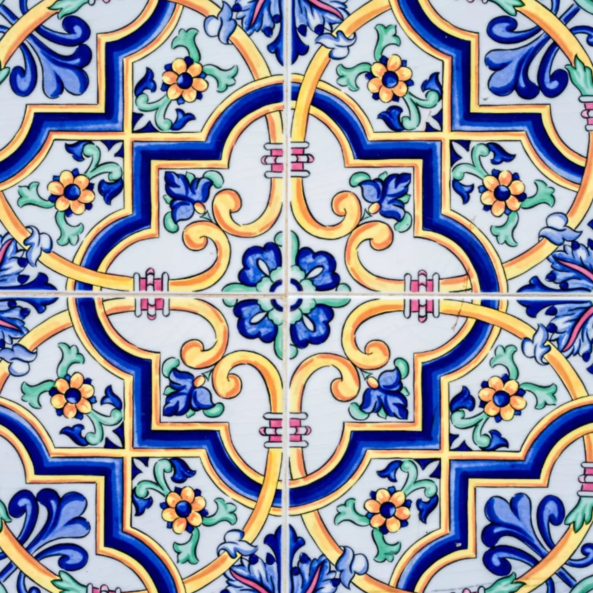
Consider a wall covered in a geometric tile. With high-contrast grout, your eye can follow the boundaries of each individual piece. Change to a grout color close to the tile, and those boundaries become quieter. The same material can create a substantially different visual impression without changing the tile at all.
This also explains why grout should be considered alongside the tile rather than treated as an isolated color selection. The grout is repeated throughout the entire installation, so even a subtle difference between two grout colors can become much more apparent once it covers a larger area.
What About Grout for Bold or Colorful Tile?
Bold tile introduces another consideration because grout options commonly available for residential projects tend to fall within a more neutral range. Whites, beiges, browns, grays, and blacks provide many possibilities, but they will interact differently with a strong tile color.
The original article cautions against automatically trying to match grout to tile colors such as red, blue, or green. An exact or near-exact color match can become visually overwhelming, depending on the tile. A neutral grout may give the tile color more room to carry the design.
White grout is one option discussed in the original article for colorful tile, while beige, gray, or black may work with certain color schemes. The surrounding materials and intended design direction still need to be considered before making that selection.

Common Grout Color Mistakes
One common mistake is waiting until the tile has already been selected to start thinking seriously about grout.
That can create a disconnect between the tile you originally liked and the finished surface you pictured. A tile chosen for its distinctive shape may lose some of that definition when paired with a similar grout color. A simple tile may suddenly feel much busier when every edge is outlined with strong contrast.
Another issue is assuming that grout is too small a detail to influence the room. A single grout joint is small. Hundreds of joints spread across a tiled surface are much harder to ignore.
The goal during design is to consider the tile and grout together so the completed installation reflects the visual effect you intended.
A High-Level Look at Choosing Grout Color
Grout selection does not require starting with a specific color. It helps to begin with the role you want the tile to play in the room.
- Look at the tile itself. Consider its color and shape, along with how it will be arranged.
- Decide how visible you want the grout lines to be. Greater contrast will bring more attention to individual tiles and the pattern they create. A closer color relationship will make the joints quieter.
- Consider the surrounding design. Cabinetry, countertops, plumbing fixtures, and other finishes contribute to how the tile and grout combination reads in the completed space.
- Evaluate the combination together. Grout should be selected as part of the tile design rather than judged only as an individual color.
This sequence keeps the decision connected to the room as a whole without reducing grout selection to a universal formula.
How Grout Color Can Affect the Longevity of a Design
Tile is a durable finish, so the visual decisions surrounding it deserve some thought before installation.
A grout color that heavily emphasizes a particular pattern will continue doing so for as long as the tile remains in place. A quieter pairing will have the opposite effect. Understanding that difference ahead of time helps homeowners choose based on the finished surface they want to live with rather than evaluating a small grout sample on its own.
This is especially useful in kitchens and bathrooms, where tile can cover a substantial portion of the visible room.
How Stearns Design Build Approaches Tile and Grout Selections
At Stearns Design Build, we work through material selections during design so details like grout can be considered in relation to the rest of the project.
A grout choice can affect how a tile pattern reads once installed, which means the decision belongs in the larger material conversation. Looking at those relationships during design gives homeowners a clearer picture of what their selections are working toward before construction begins.
This reflects the broader purpose of our design process. Decisions are made in an intentional order so the construction team has a defined direction to work from, and homeowners are not being asked to resolve design questions after work is already underway.
Frequently Asked Questions
Does grout color change how tile looks?
Yes. Contrasting grout makes the boundaries between individual tiles more visible, while a grout color closer to the tile can make those boundaries less prominent. This can change how strongly you notice the tile shape and installation pattern.
Should grout match the tile?
It depends on the visual effect you want. Similar colors can create a quieter appearance, while greater contrast can emphasize individual tiles. The original article also cautions against assuming that matching grout is appropriate for every bold tile color.
What grout colors are commonly available?
The original article identifies white, beige, brown, gray, and black as common neutral grout colors. The available options provide different levels of contrast depending on the tile being used.
Does dark grout work with white tile?
It can. Dark grout creates noticeable contrast against white tile and makes the shape and arrangement of the individual tiles easier to see. White tile with dark gray grout is one example discussed in the original article.
When should grout color be selected?
Grout is best considered as part of the tile design rather than as an isolated finishing decision. Looking at the combination during the design phase makes it easier to understand how the grout will influence the finished surface. This also fits Stearns Design Build’s current process standard of resolving design decisions before construction whenever possible.